Knitting App

Problem: Knitters can store their patterns digitally but are unable to take notes directly on the patterns for later referencing.
Tools Used
Figma
Process
User Research interviews, Persona, Ideate, Wire-framing, Prototype, Usability Test, Iteration
Project Details
Personal Project
Feb 2023-Feb 2024
Team
Diana Ericksen
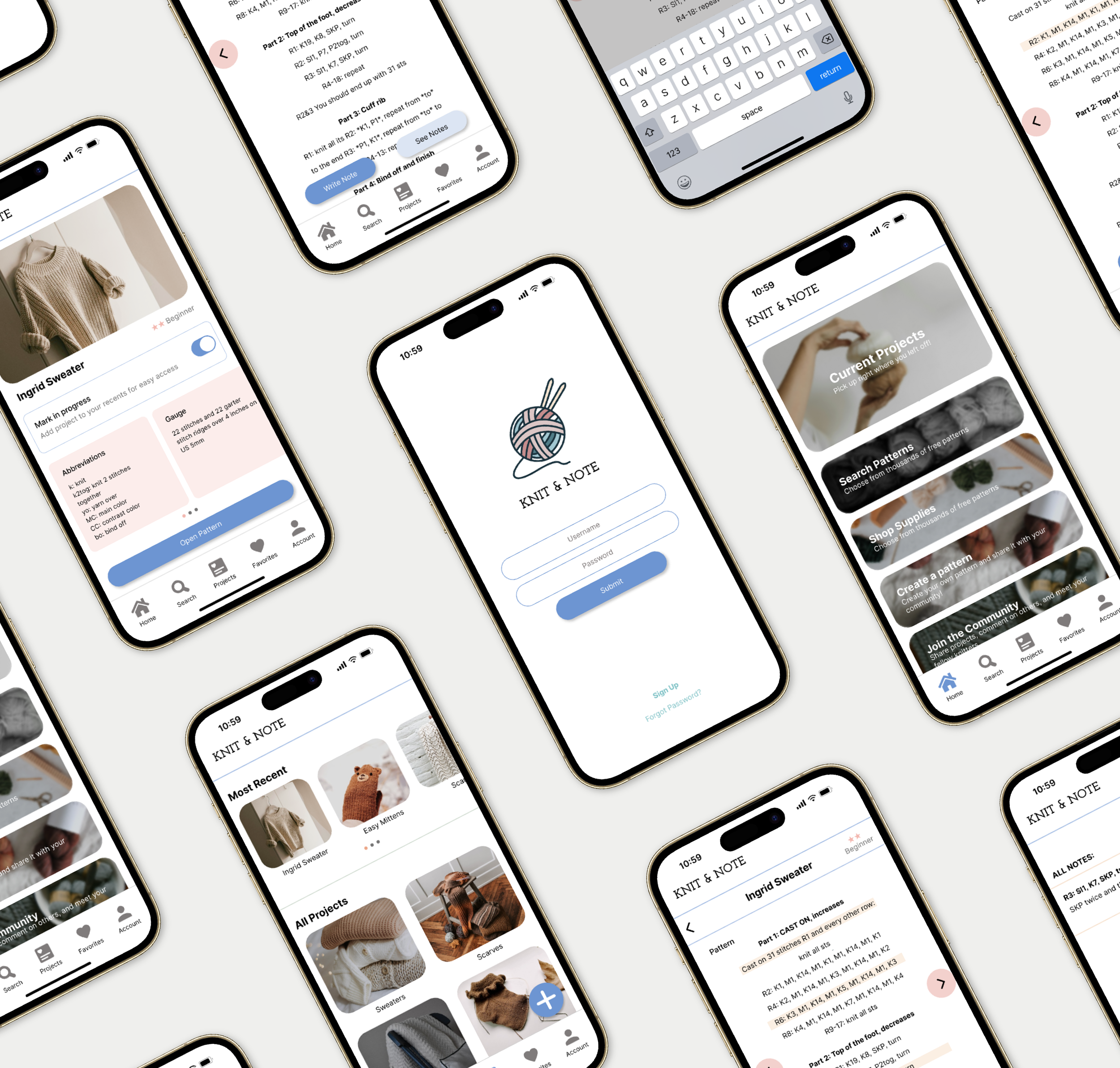
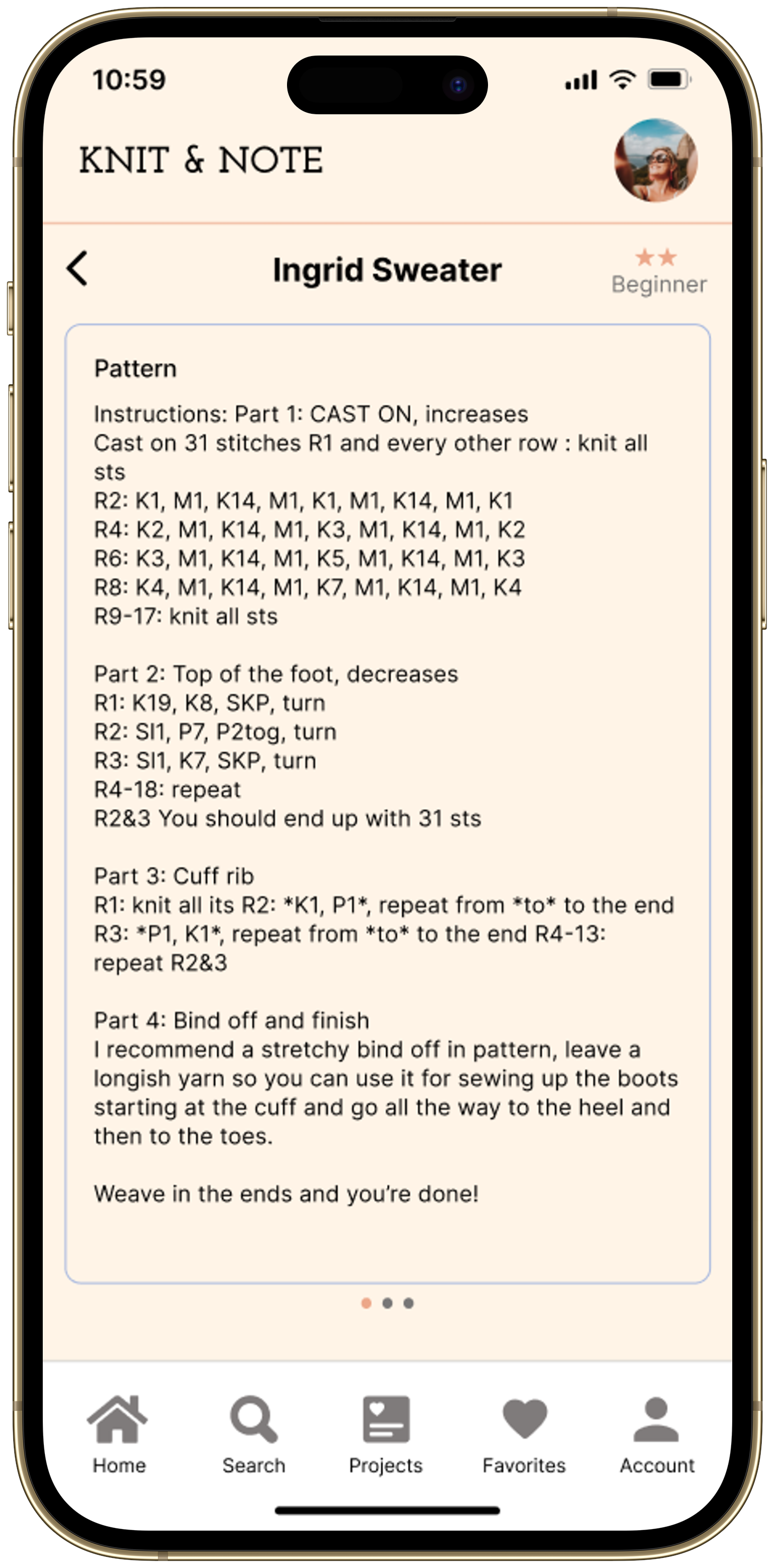
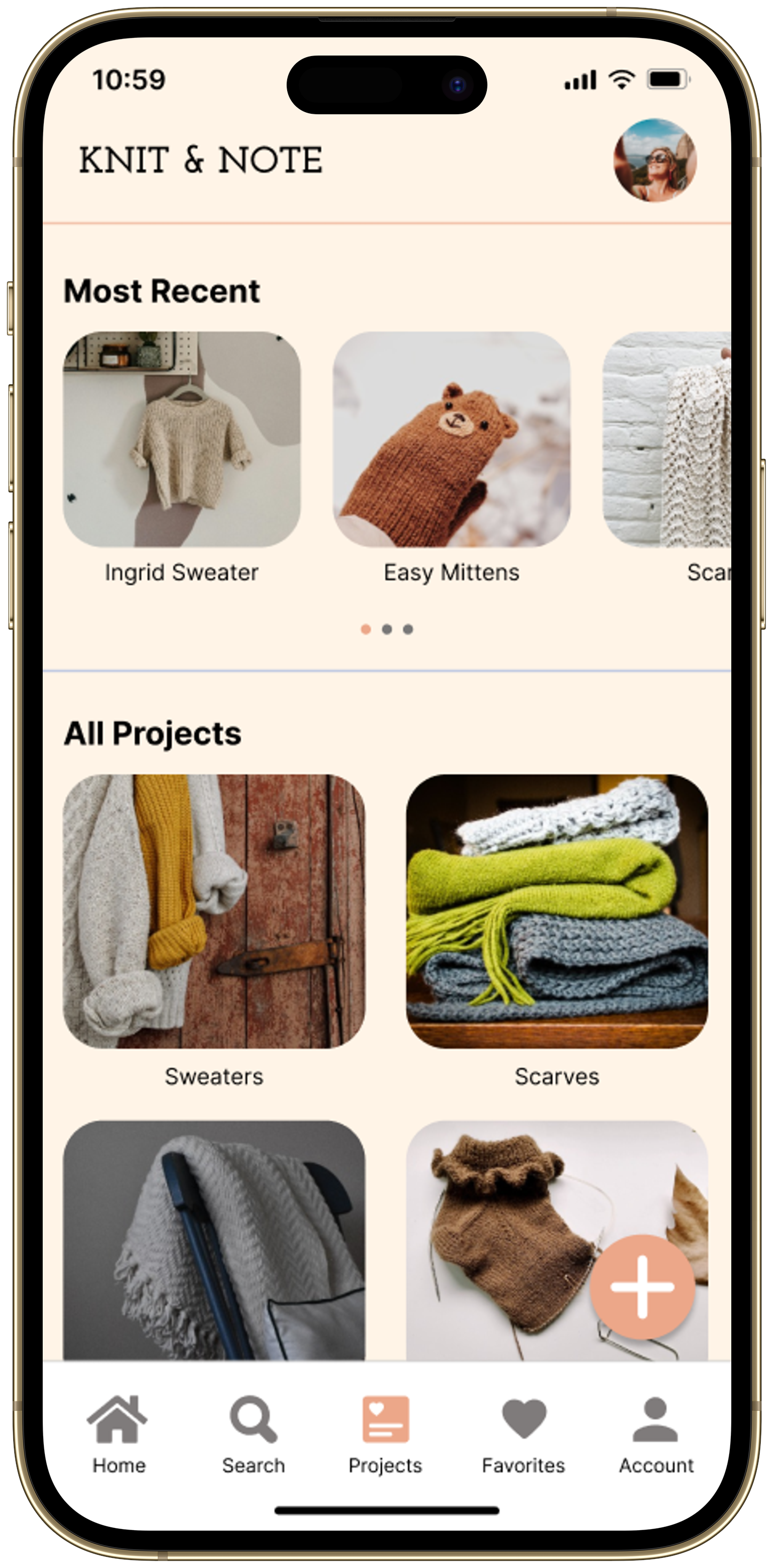
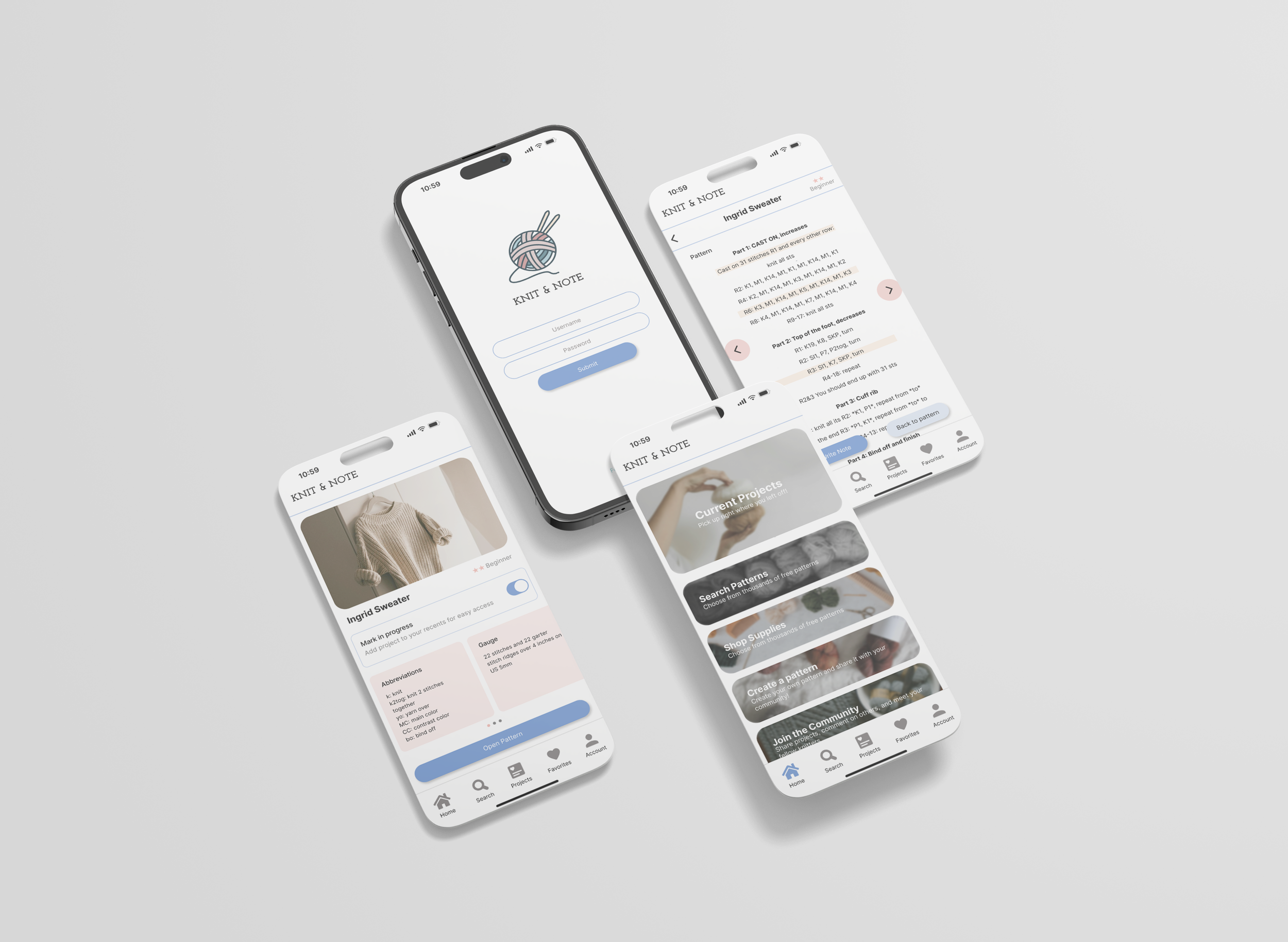
The Solution
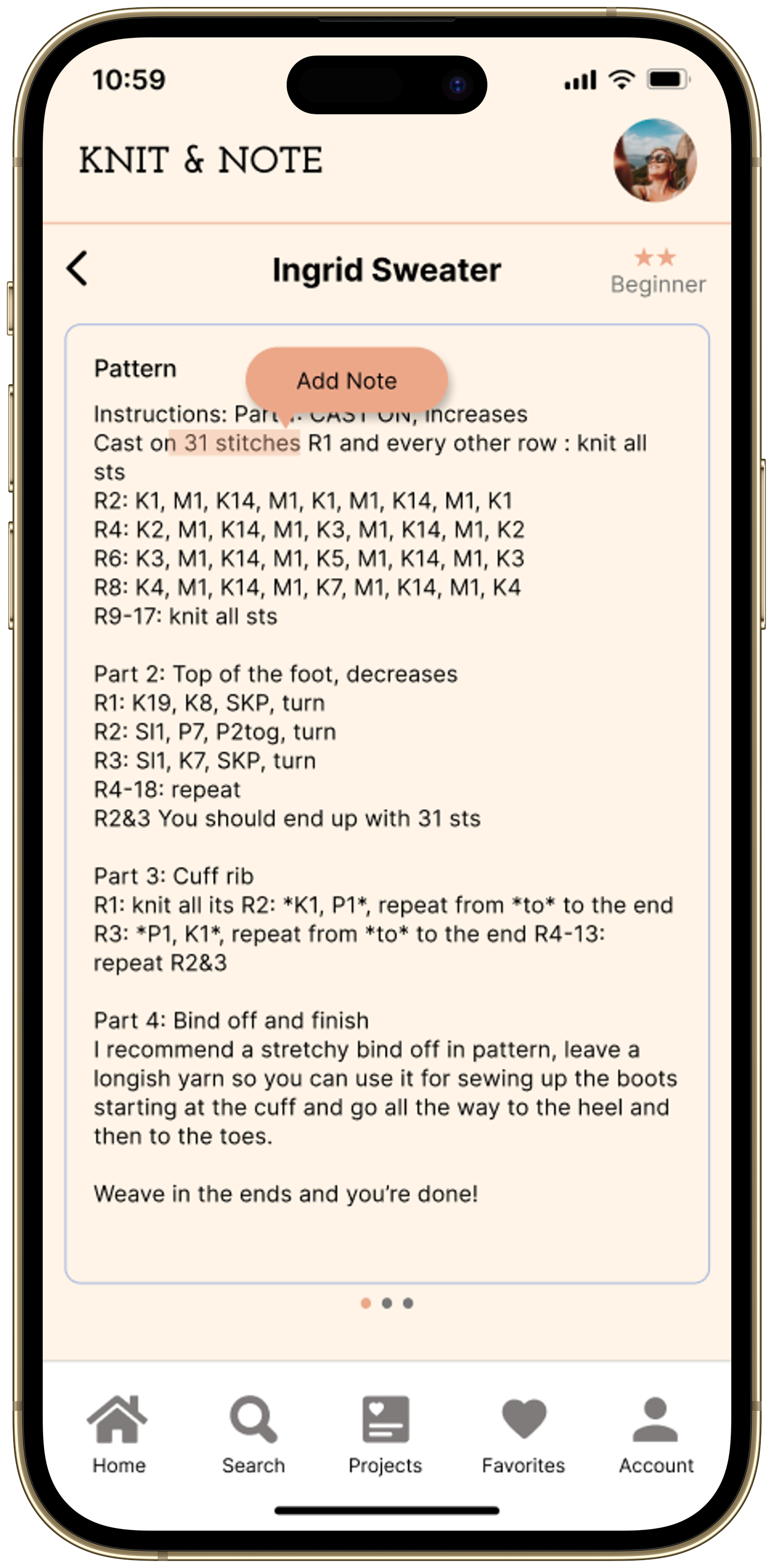
Users can toggle through their digital knitting pattern, line by line, using forward and backwards arrow buttons on the side of each pattern. This allows users to keep their place while knitting.
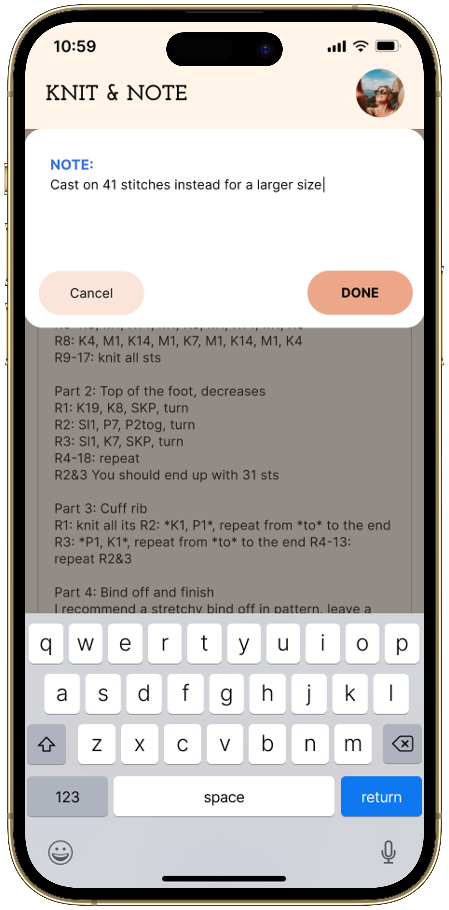
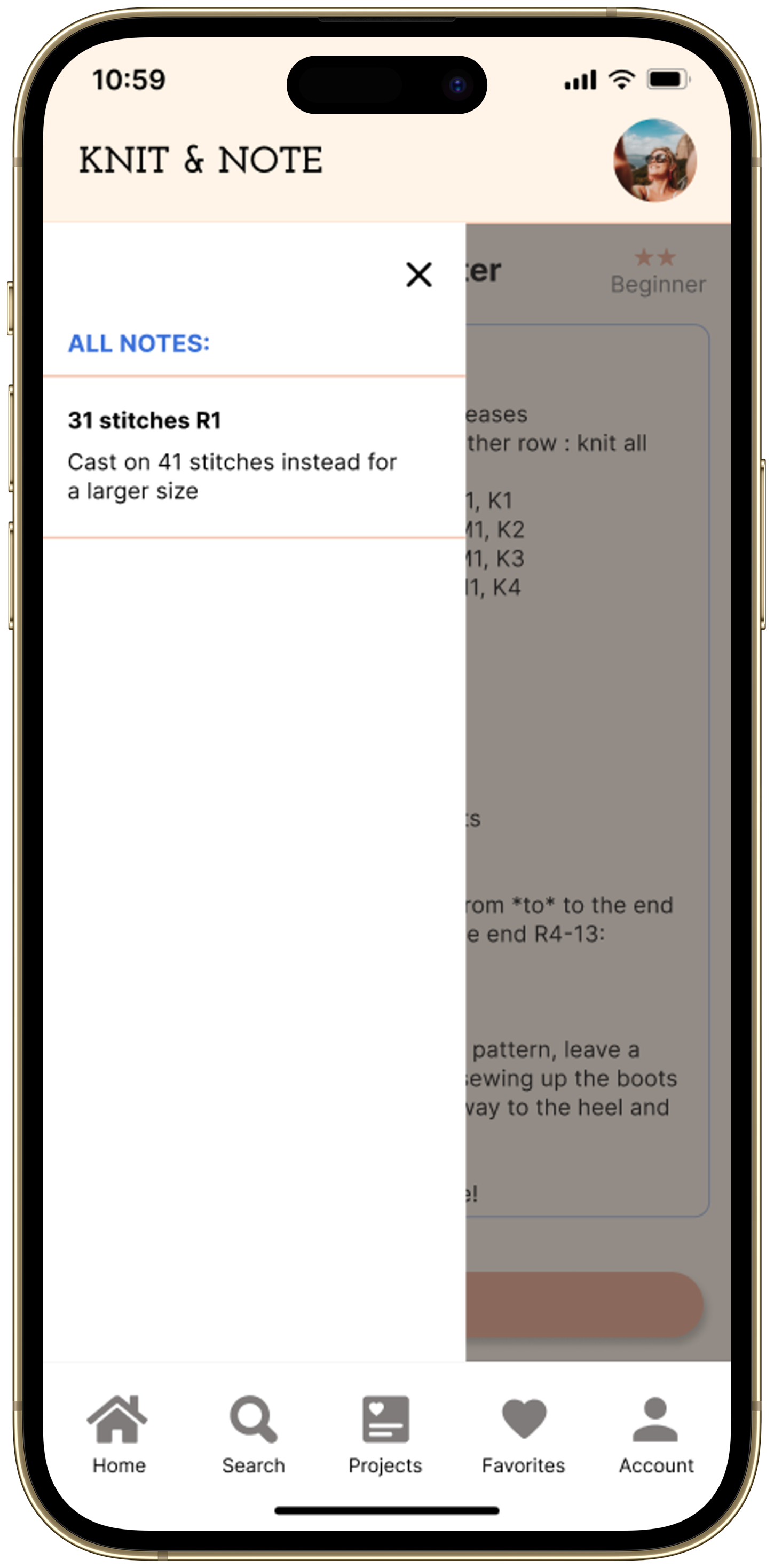
While toggling through, if users come across a highlighted line they want to make a note on, they can click “Write Note” and a note-taking window will pop up.
Once their notes are created, they can click the “See Notes” button to see which lines they’ve taken notes on and what the notes are.
Design Process
Empathize
I conducted two in depth interviews to determine the issues users have while knitting using a pattern. The first interview was with a 27 year old female who works as a designer and the second interview was with a 30 year old male who works in cyber security sales. Both interviews surprisingly concluded with a similar pain points amongst both knitters: they typically will print out a pattern from the internet and then make notes on the pieces of paper. Therefore, they had no streamlined method to do this process digitally.
“Once I get a project from Ravelry I’ll download it as a PDF and then print it out since I typically write notes on my patterns….I have a folder where I’ll rank the patterns (if I liked it or not) and group them by category, ie. all the scarf patterns together, all the blanket patterns together, etc.” - Kate 27 y.o. Designer
Define the problem
After conducting my interviews I created a persona based on the information I gather from the participants to help hone in on my target audience. The target users were knitters/crocheters who have 50+ patterns completed and typically like to take notes on their patterns. While I initially started the project thinking the issue users faced would be their pattern storage, I recognized my original hypothesis was too broad so I narrowed it down to focus on the note-taking aspect:
“Knitters can store their patterns digitally but are unable to take notes directly on the patterns for later referencing.”

Ideate solutions
I started ideating with crazy 8s to get some quick ideas out, focusing on the basic structure of how I’d like the note-taking aspect of the app to work. I ended up moving forward with option 1 (top left). The idea of the text on the pattern being highlighted seemed like a good way to indicate to the user which line they would take a note on.
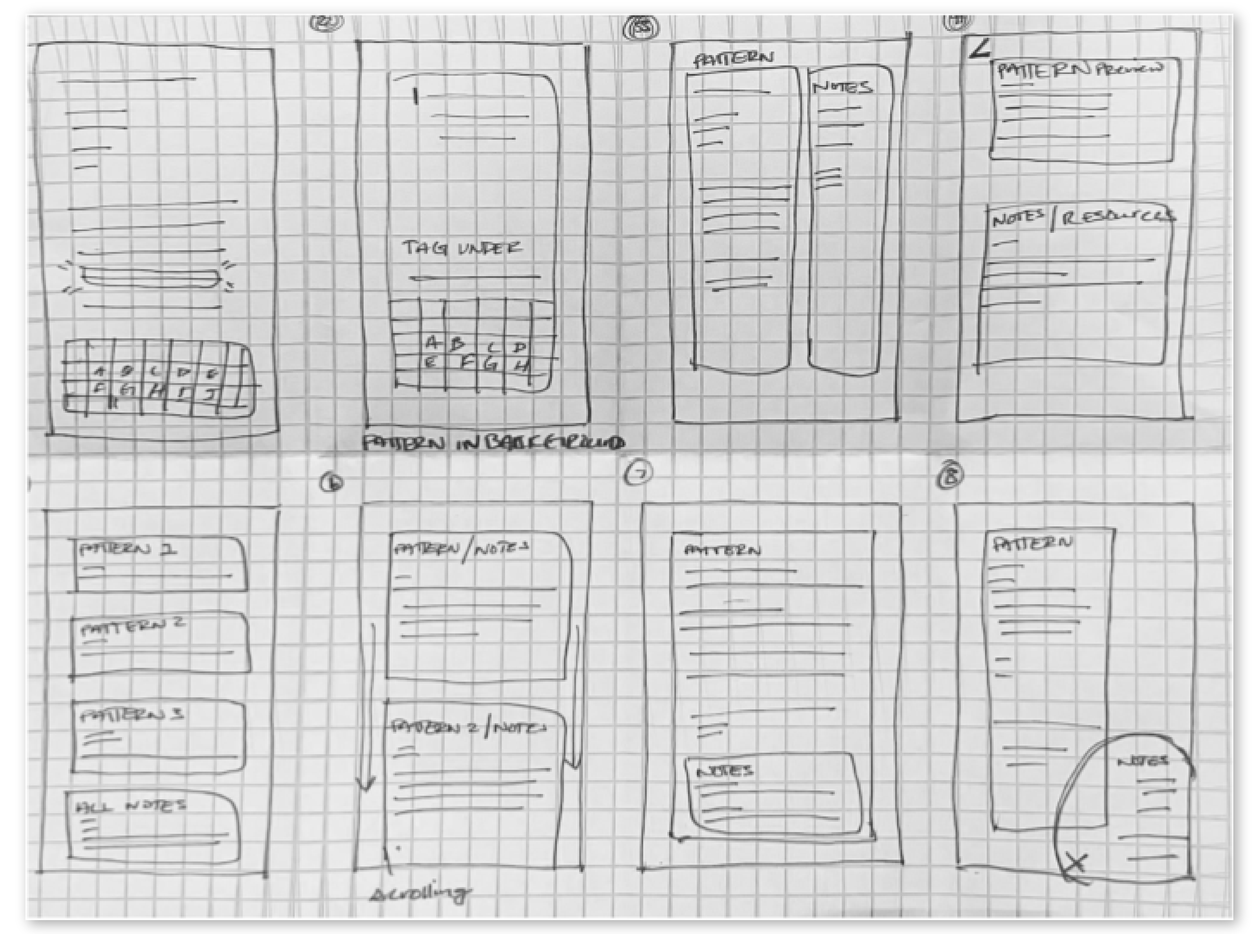
Wire-framing
Through wire-framing I created a low-fidelity prototype of a suspected user flow to showcase how a note-taking feature might function. Focusing on how a user would get to the pattern and how they’d be stored on the app, as well as how a note-taking window might pop up on the screen of the pattern, elaborating on the idea from crazy 8s. A pain point I was facing at this point was how the “add note” function would be indicated for users.

Style Guide
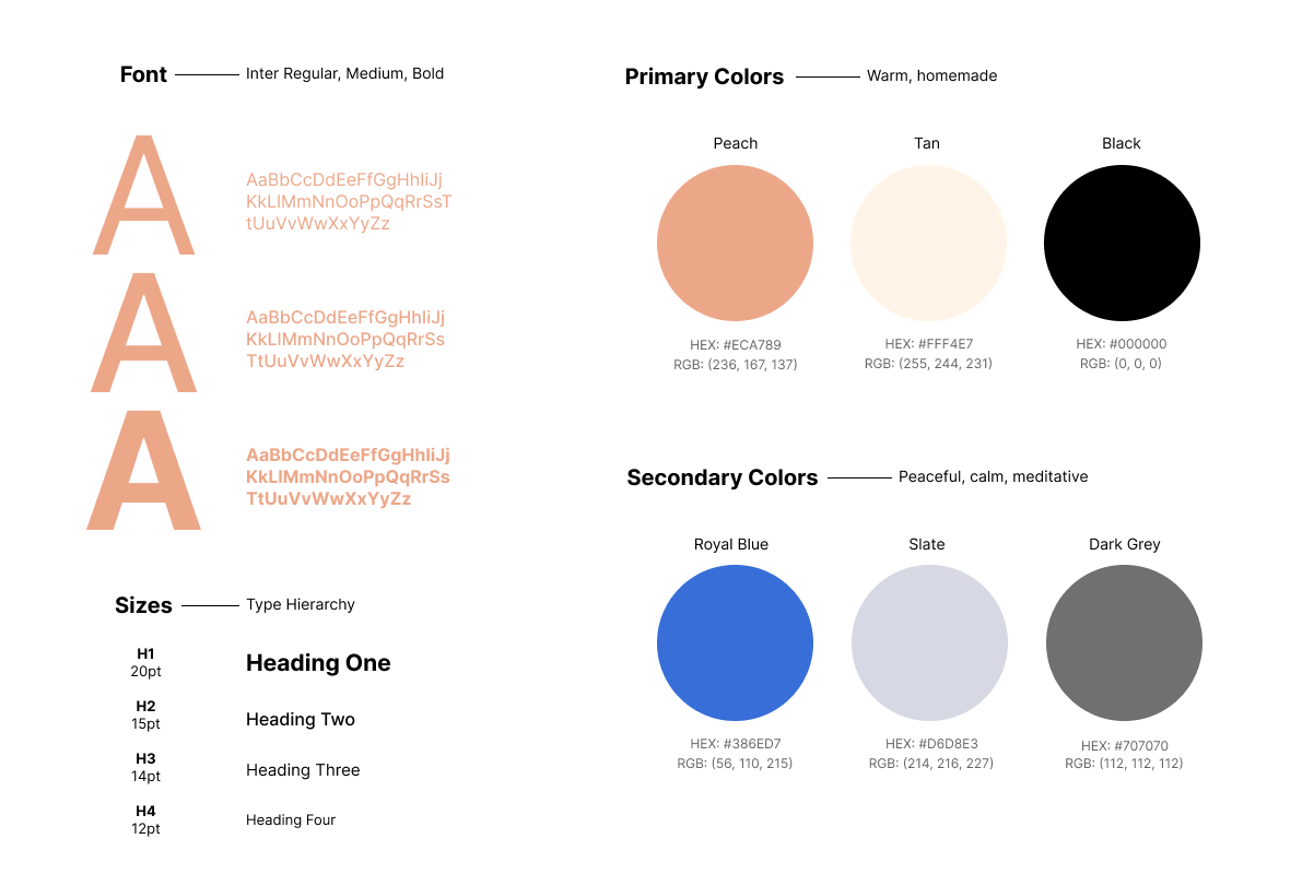
UI Design - Typography + Colors
For my primary typeface I used a simple, legible sans serif font to ensure maximum readability throughout the knitting patterns, since the design requires a heavy amount of text. I established various heading sizes to ensure a hierarchy of text so users can easily find important information as well as encourage users to engage in the CTA’s.
I picked the main color of a peachy orange tone to try and elicit the feeling of something warm and homemade, with a accent color of two different shades of blue to represent something calming and meditative. Most of the text throughout the design is black and/or a lighter grey to ensure maximum readability and accessibility.
Prototype
My hi-fidelity prototype continued to elaborate on my wire-frame design. In order for the note-taking screen to pop up I came up with the solution to have users highlight the text they needed to take a note on. Since it’s customary for options to pop up after highlighting text on iOS devices, I felt this function would be familiar to users, with an “add note” button popping up after highlighting. As you’ll see below, this option turned out to be not as intuitive as expected with users so I needed to rethink this solution while getting users feedback.


Usability Testing
A usability test with two users that were previously interviewed at the start of this project revealed issues with the type size being too small on the knitting pattern, as well as functionality not being intuitive enough. Two main pain points persisted:
Both users felt the patterns should be separated by lines, and instead of needing to highlight the text to add a note, you could select the line of the pattern you wanted to make a note on.
Furthermore, both users wanted a way to keep track of which line they were knitting on since the design contains a lot of text.
”It’s was easy to navigate to the pattern page, I like how everything before that is set up, but think there can be an easier way for people to add notes because I wouldn’t necessarily think to highlight text to add a note” - Kate 27 y.o. Designer
”Adding a note in a specific spot with the marker indicating which line you’re making a note on would be good.” - Nicholas 30 y.o. Cyber Security Sales
Adjusted Style Guide

UI Design - Typography + Colors
I decided to adjust some of the coloring of the application to simplify the design overall. Nixing the cream background allowed for the design to feel less crowded due to the crisp white in it’s place. While a peachy tone was the original primary color, I adjusted to it be an ocean blue to prioritize the calm, serene feeling associated with the color, while still including a warm blush/pink as a secondary color to elicit the warm, homemade craft of knitting.
Iteration
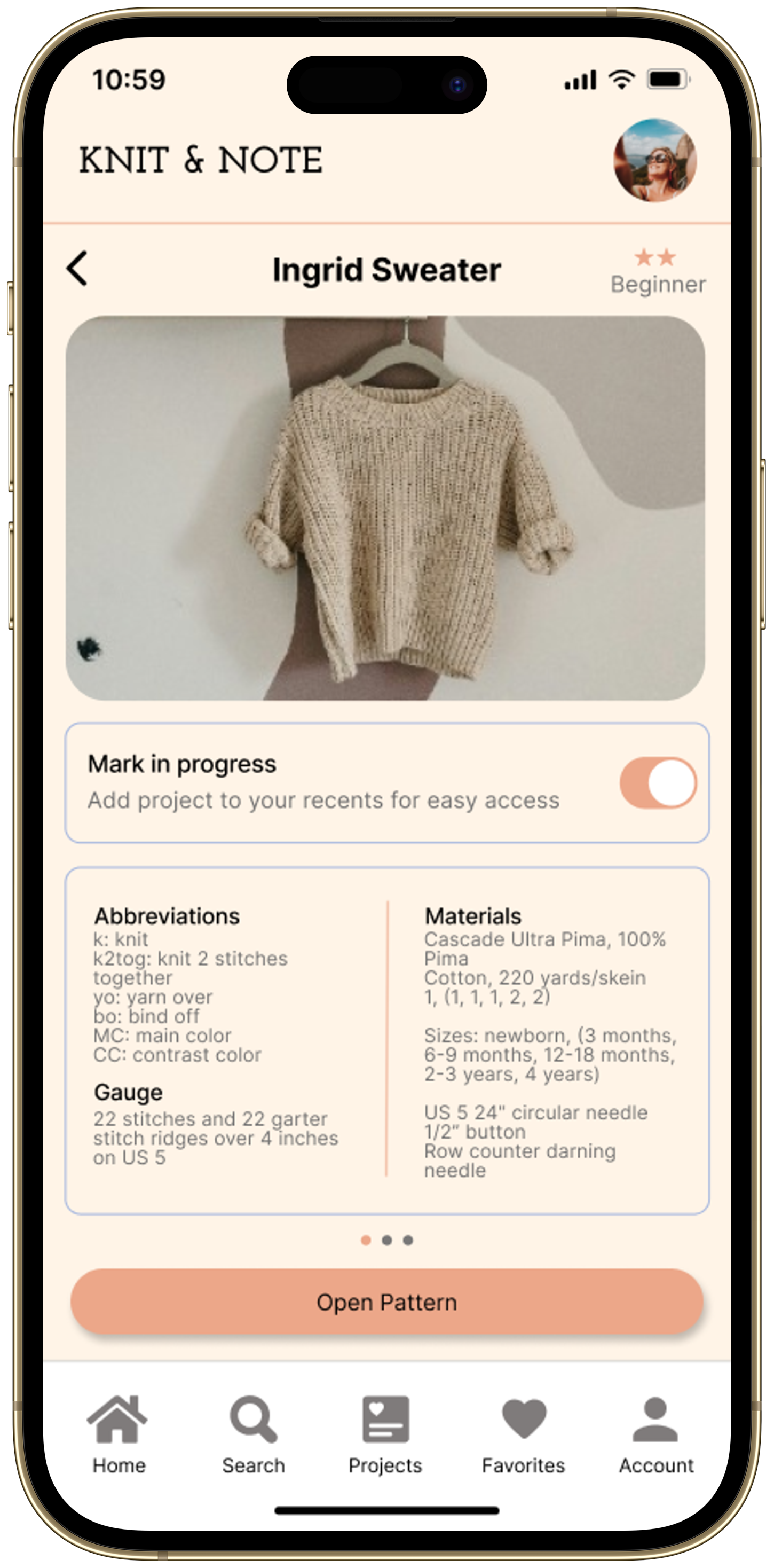
To incorporate all of these functions I adjusted the design to be able to toggle up and down the pattern so that you can easily keep your place while knitting. This will also allow users to write a note for the current highlighted line by clicking the “write note” button. I added a “see notes” button so you can get an overview of all the lines you’ve added notes to, highlighted in a cream color. Users can then simply click the highlighted line to see what note they wrote.
I also updated the UI design to be more clean. I refocused the main color to be a medium-toned blue to bring a calm feeling to the forefront on a crisp, white background. The accent colors are a warm pink and peachy cream.
Reflection
From start to finish this design relied heavily on the learnings from users. Because of the research conducted, the original hypothesis was adjusted as well as the initial high-fidelity prototype after usability testing. It shows the importance of feedback we get from users so the design functions to the best of its ability for them.